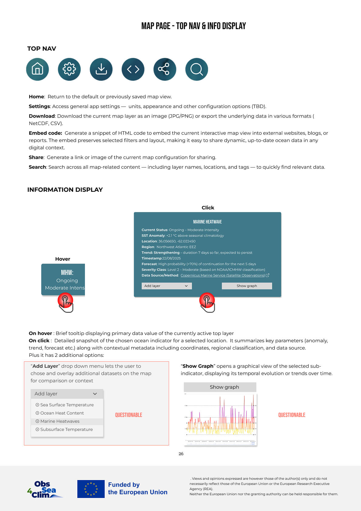
Ocean Indicators Platform for Policy makers
Ocean By Data — UX & System Architecture
DESCRIPTION : A platform for translating complex ocean data into actionable insights for policy makers.
CHALLENGE : Bridging the gap between complex scientific data and fast policy decision-making : this project explores a shift toward LLM-powered conversational access to data, enabling faster understanding without requiring domain expertise.
APPROACH : The solution introduces a layered system combining structured data visualization with an LLM interaction layer : reports and maps act as interpreted outputs, while all insights remain traceable to original datasets.
NOTE : Some details have been simplified/modified due to NDA.
CONTEXT
CHALLENGES
ROLE & CONTRIBUTIOn
CONTEXT
- ● Ocean data is fragmented across multiple platforms (Copernicus Marine Service, EMODnet, GOOS etc.), each with its own structure and logic.
- ● Existing platforms often prioritize data access over usability and clarity
- ● Diverse audience: policy-makers, scientists, NGOs, public
- ● Increasing need for ocean data in climate and policy decisions
CHALLENGES
- Data complexity : Scientific datasets are difficult to interpret without domain expertise
- Fragmentation : Indicators, formats, and visualizations vary across platforms, preventing consistent understanding
- Insights Speed : Users must navigate multiple interfaces and data sources to build a complete picture
- Clarity vs accuracy : Simplifying data risks losing scientific nuance, while preserving it increases complexity
ROLE & CONTRIBUTION
- ● Research & benchmarking of existing ocean data platforms to identify gaps in usability
- ● Information architecture and visualization strategy to move from high-level insights to detailed data exploration
- ● Interaction & visualization design: user flows, dashboards, and indicator views
Research & Structure
User needs and platform observations were used to define a structured approach to organizing and presenting ocean indicators.
Target Audience & User Requirements
Despite different goals, all users require clear interpretation of complex data.
Strategy & Analysis
The platforms reviewed provide high-quality and scientifically validated data.
The analysis focuses on how this data is structured and presented, rather than the quality of the data itself.
- ● Simplify access to ocean indicators
- ● Enable comparison across datasets
- ● Improve readability of visualizations
- ● Prioritize interpretation over raw data
Comparative analysis:
Copernicus, NOAA, EMODnet, GOOS, OBIS, +10.
- → Indicator variety
- → Visualization methods
- → System usability
- - Complex ocean data requires gradual exploration
- - Users can approach the data from different entry points and levels of detail
- - A consistent structure supports understanding across indicators
1. A progressive approach to data exploration.
2. Dedicated flows (Policymakers / Analysts).
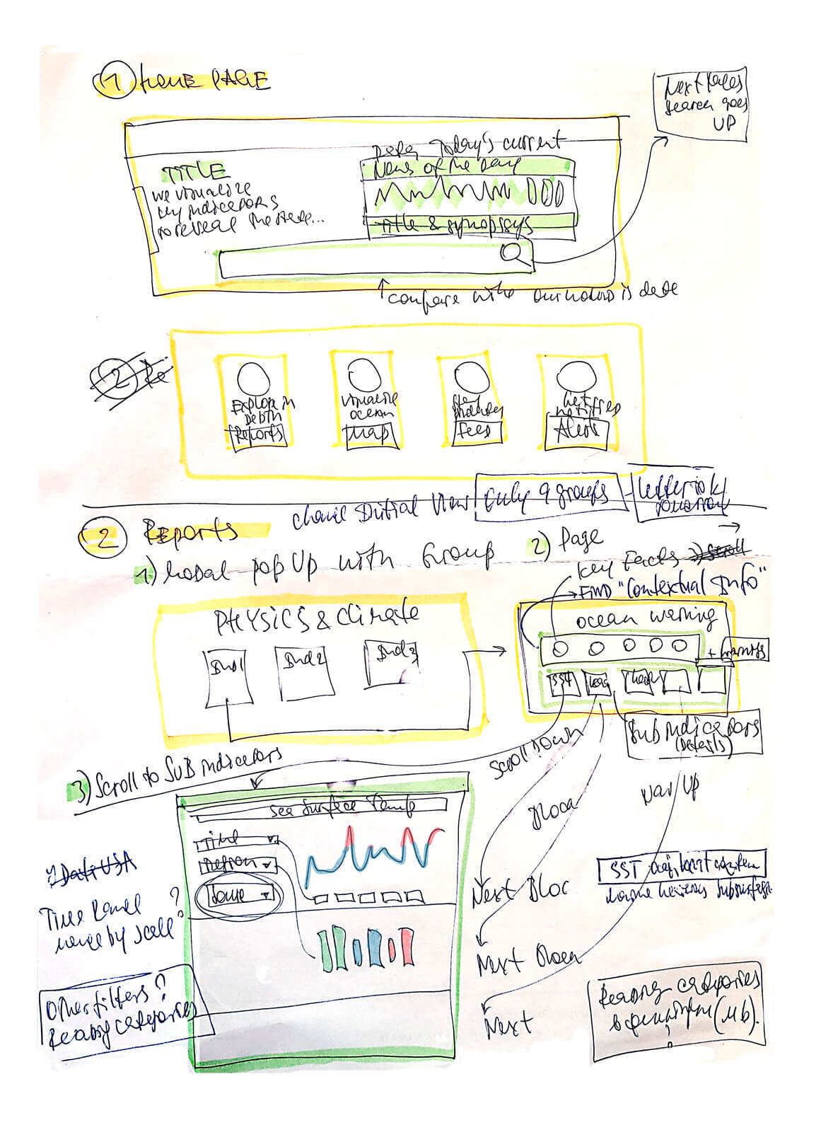
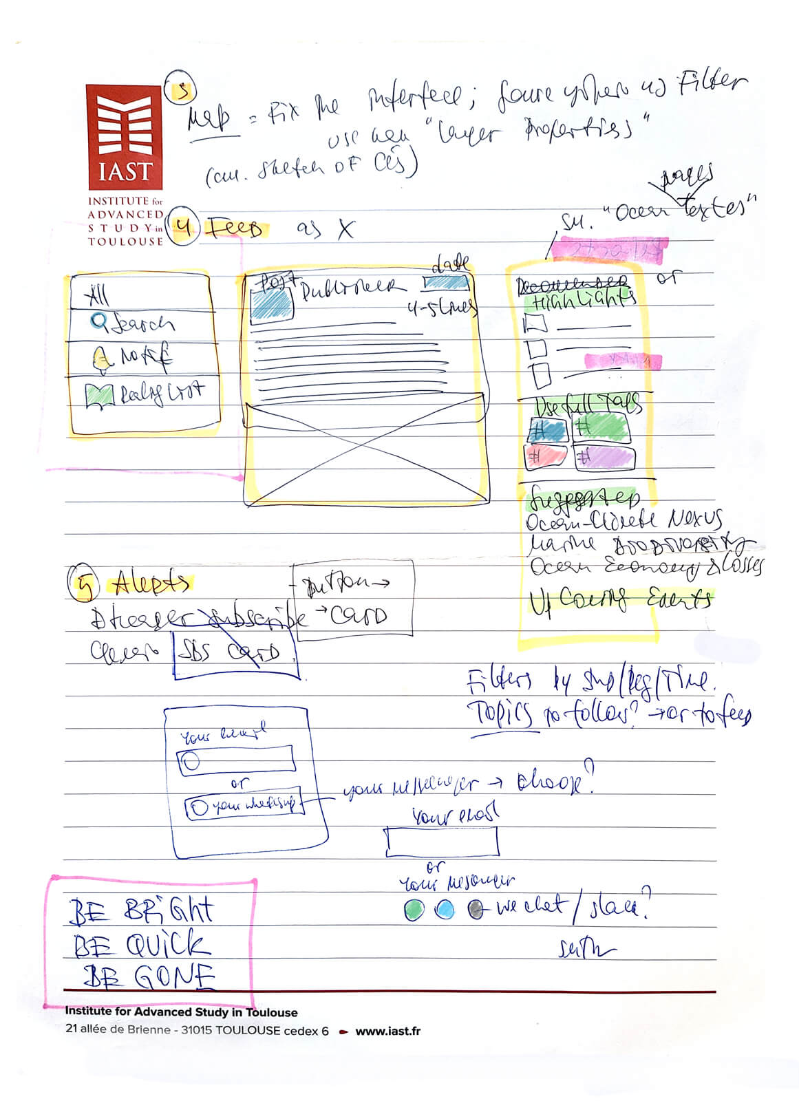
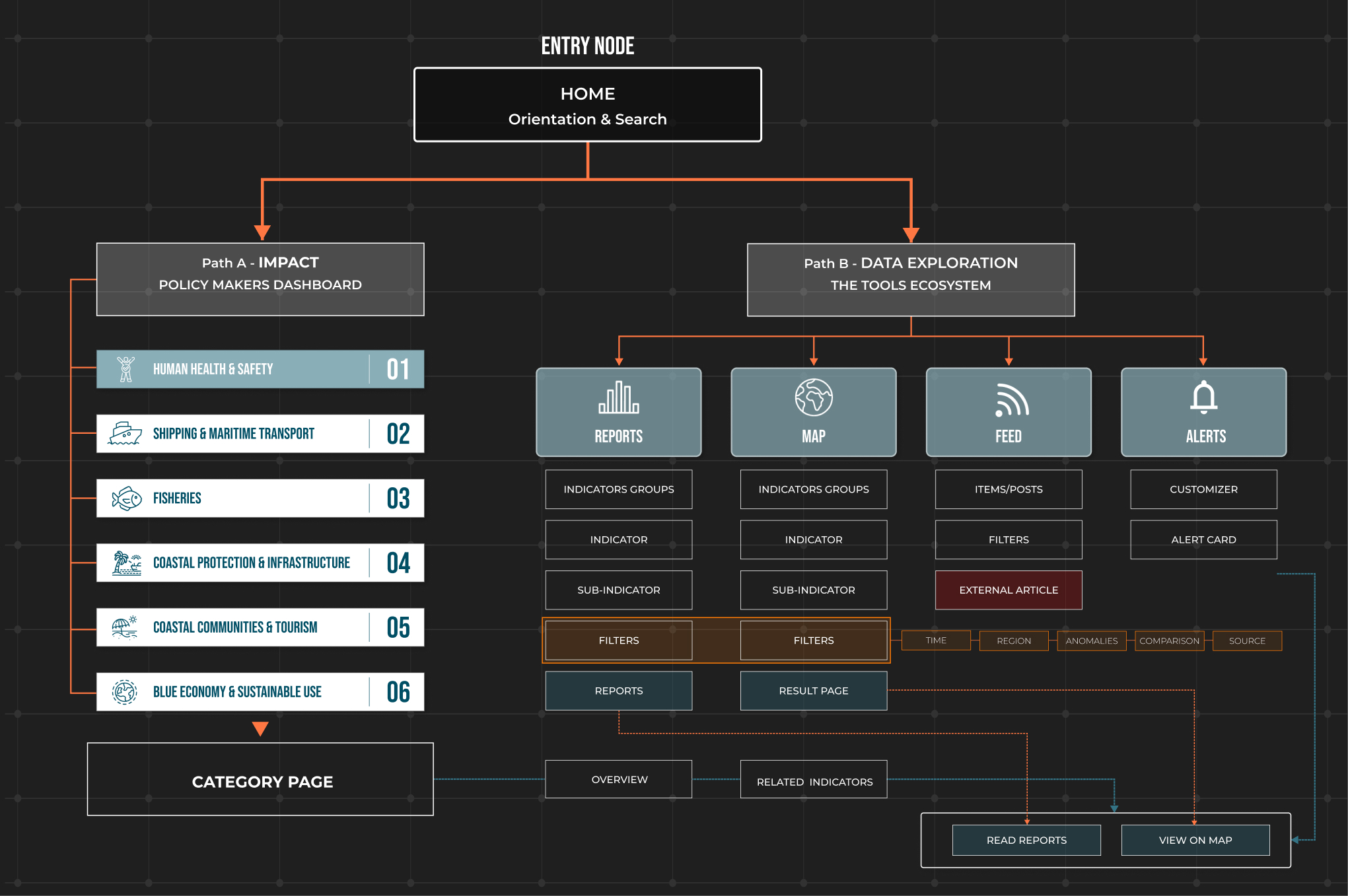
Information Architecture
The platform ecosystem is divided into two primary entry points: a Policy Makers Section for high-level summaries and a Tools engine for deep data exploration.
From this point, the architecture branches into two specialized modules: Reports, which apply filters to generate a final Report, and Maps, which use a filtering layer to produce a Result Panel. Supplementary Feed and Alert modules provide real-time updates that interlink directly back to these core outputs.
Both pathways follow a unified functional hierarchy:
Indicator Groups
→
Indicators
→
Sub-indicators.
- ● Reports: Filtered data → Final Report
- ● Maps: Filtered data → Result Panel
Supplementary Feed and Alert modules provide real-time updates that interlink directly back to core outputs.
Interface sketches
● Two complementary ways of exploring the data
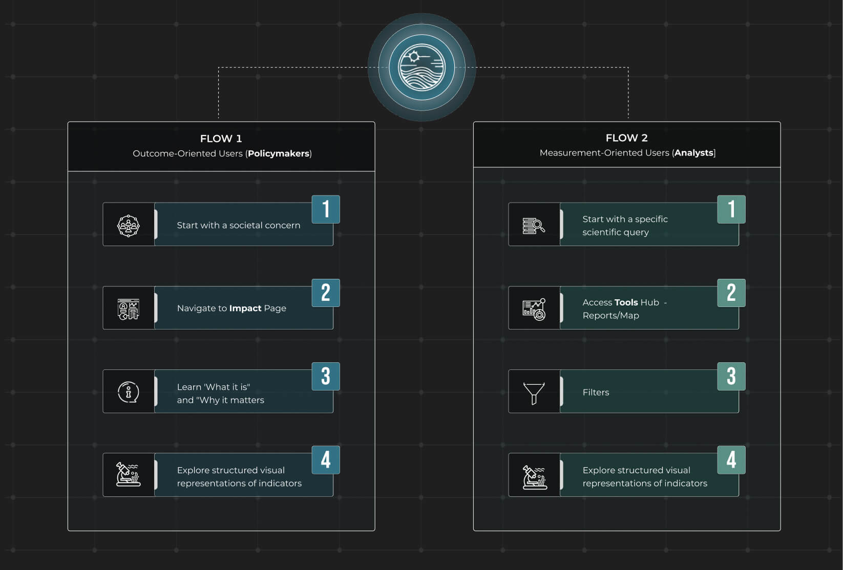
● User Flow
Design System & Data Visualization
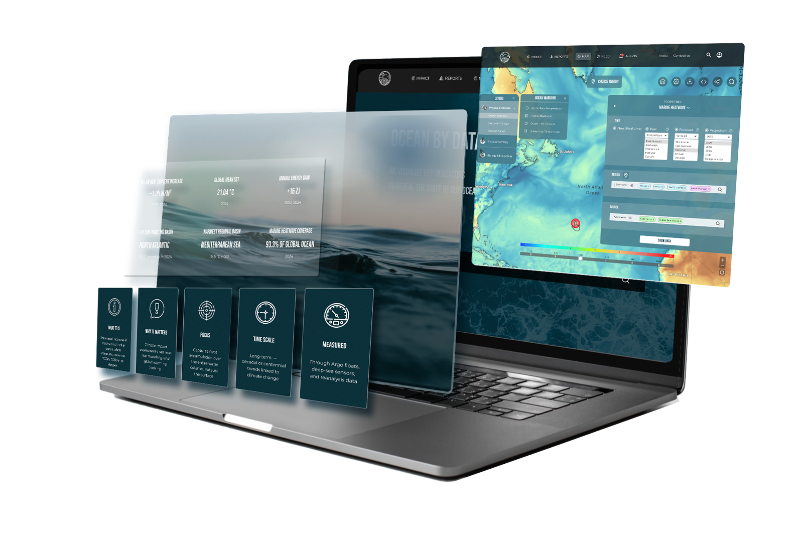
Here are the core UI components along with key data visualizations used in the final report of the indicator.
UI components
Data Visualization
Due to the volume of data, charts are designed as interactive elements rather than static images.
The examples shown are illustrative; in the final system, visualizations are generated from official datasets.
Plastic pollution in the ocean demands special attention. To make its dynamics, geography, and rankings visible, I used three interactive formats: a line race, a projection map, and a bar chart race.
Live data → visual clarity → faster decisions. No spreadsheets, no delay..
Design Specification & Interaction Documentation
The primary deliverable is a structured design specification defining the system’s information architecture, interaction logic, and LLM-assisted data flows.
A multi-layered ecosystem for ocean data implementing:
- ● Structured Visualization: Interactive maps and comprehensive reports.
- ● AI Intelligence: LLM-generated summaries and smart previews.
- ● Data Integrity: Fully traceable links to underlying datasets.
The technical and behavioral framework includes:
- - System-level information architecture and navigation logic.
- - Key interaction patterns for desktop and mobile contexts.
- - Behavioral rules for deep data exploration.
- - Logic for LLM-assisted output generation.
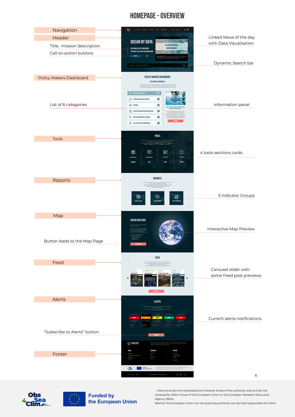
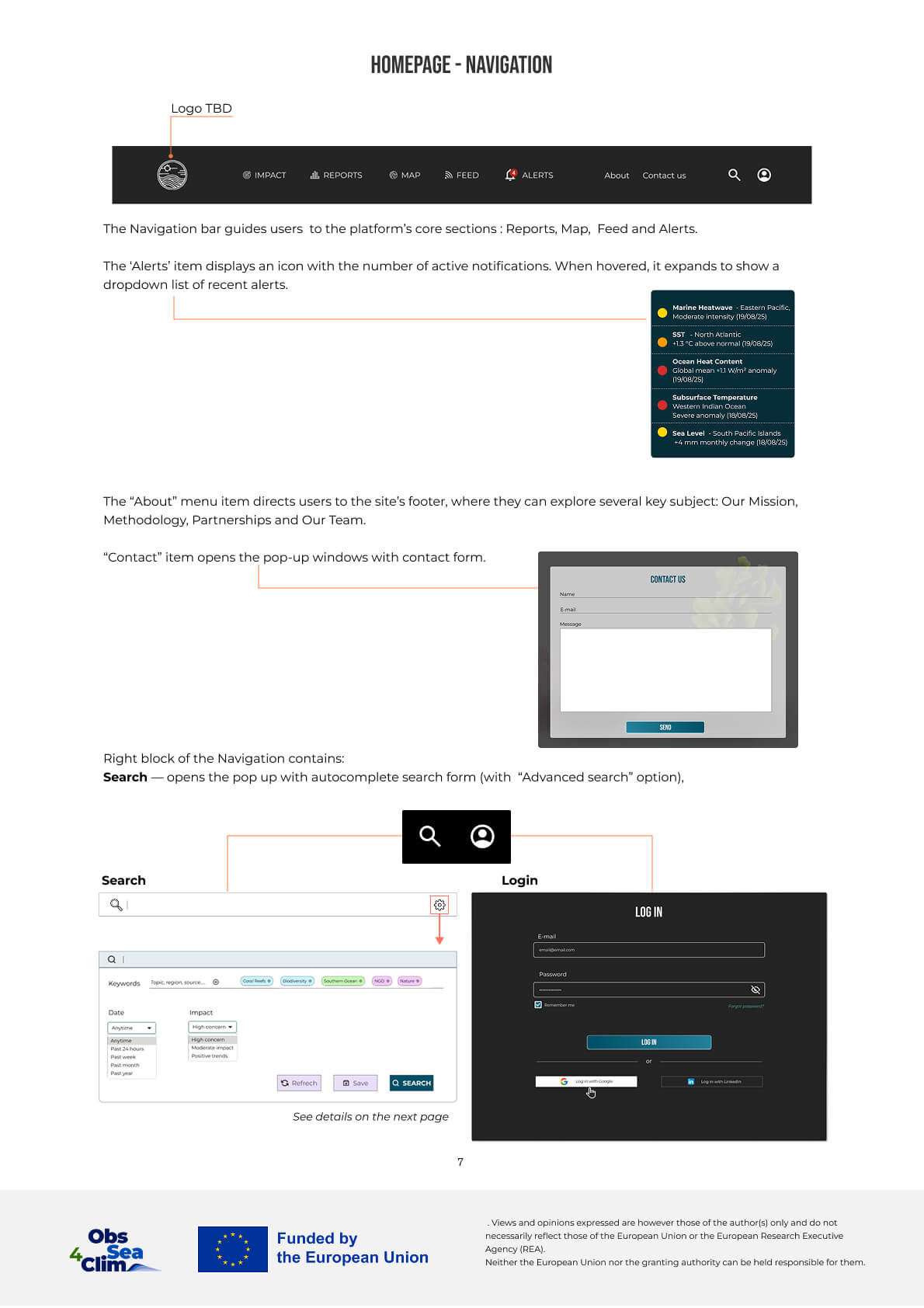
Landing
Overview
Structure
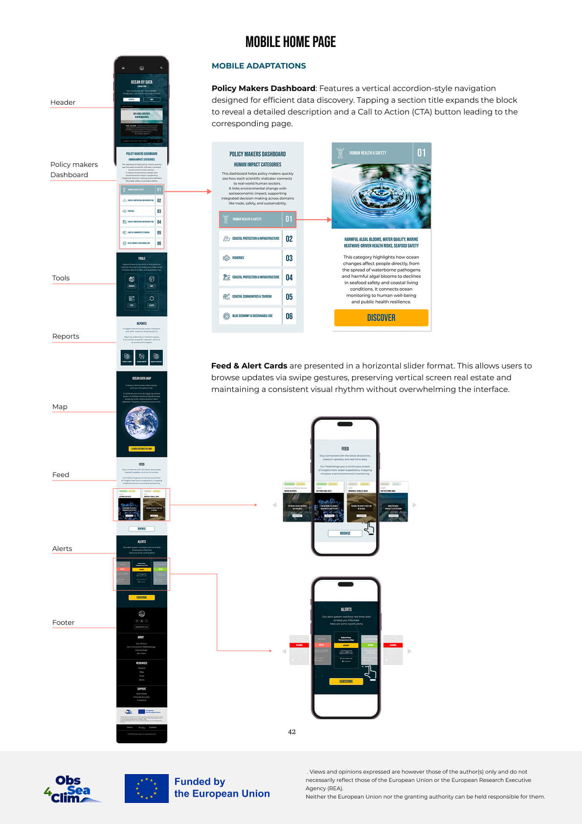
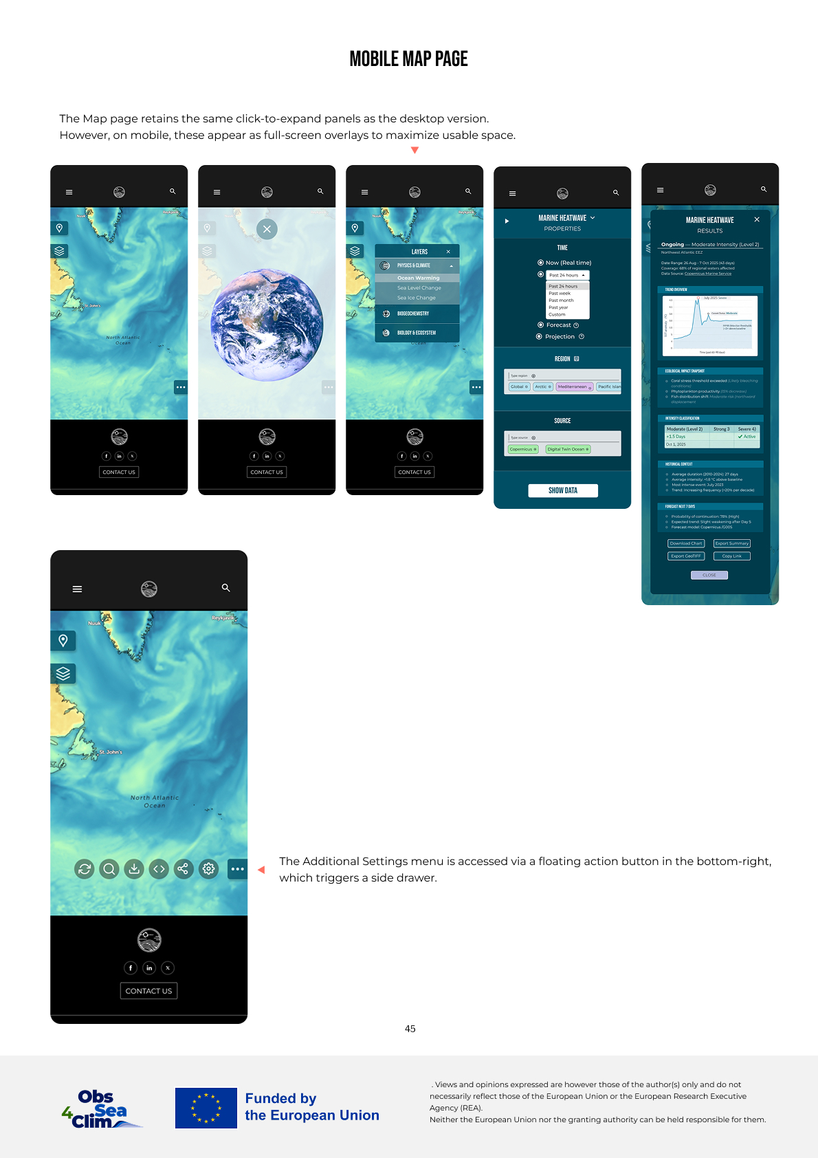
Mobile
Human impact and Reports
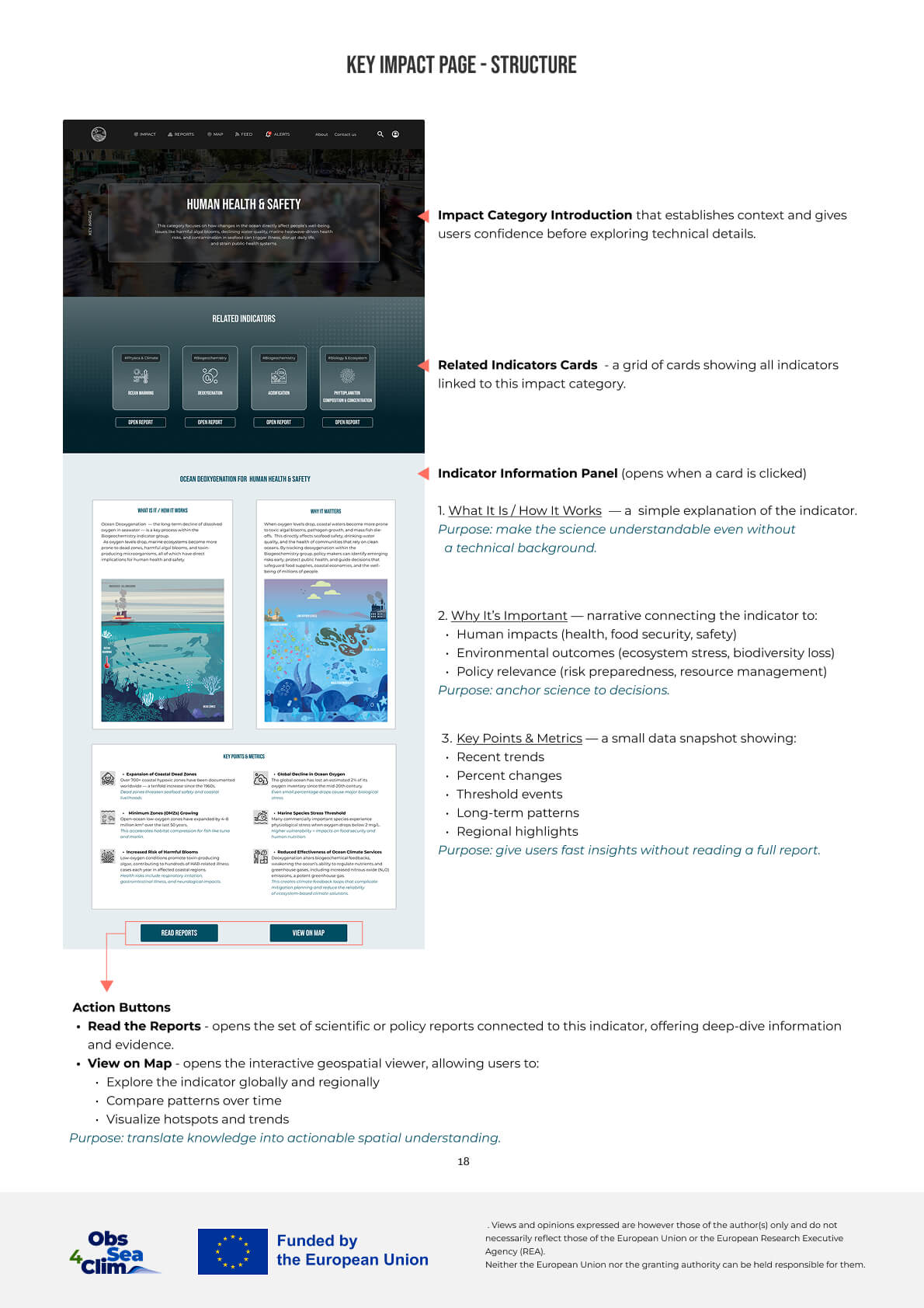
Impact structure
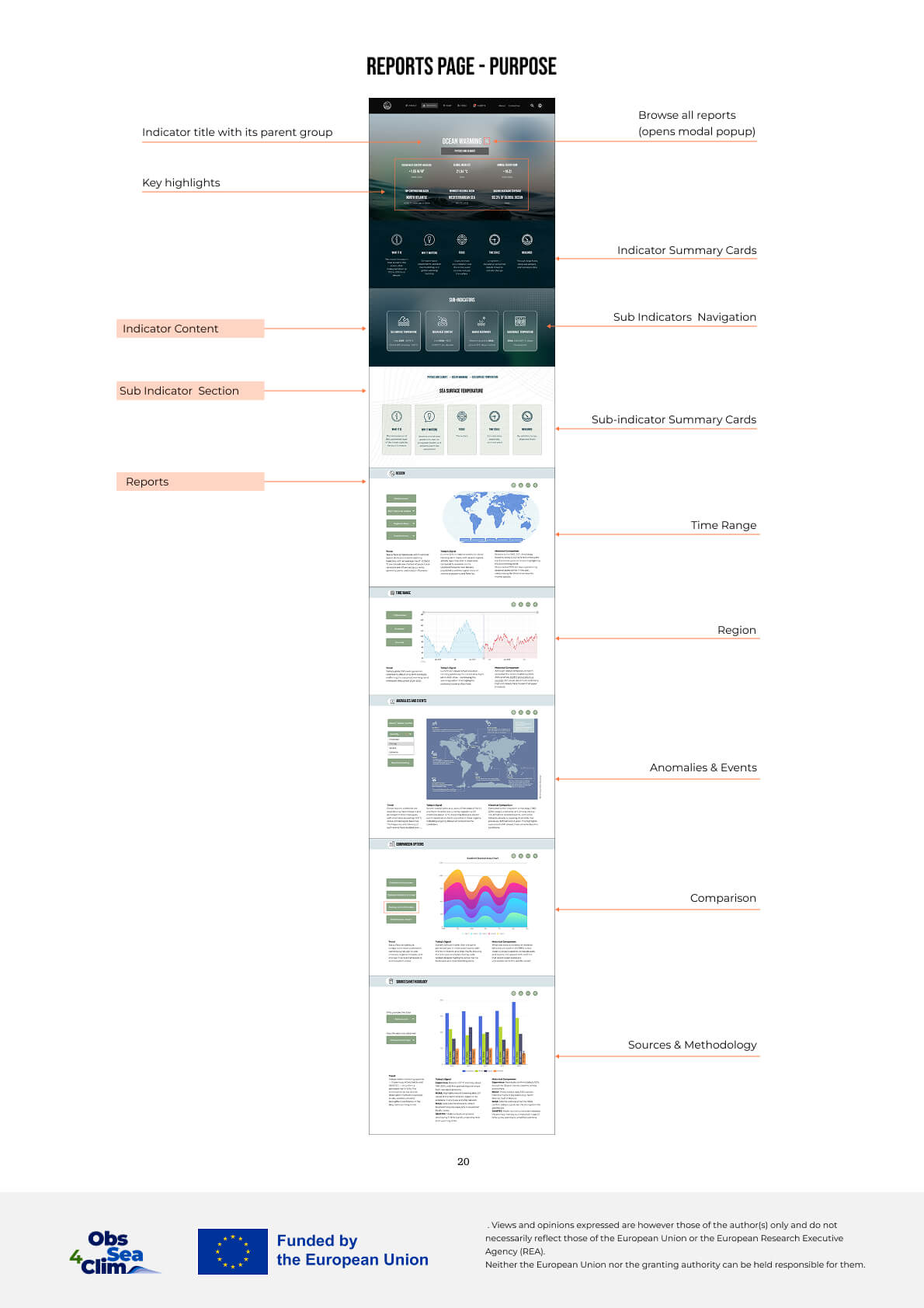
Reports structure
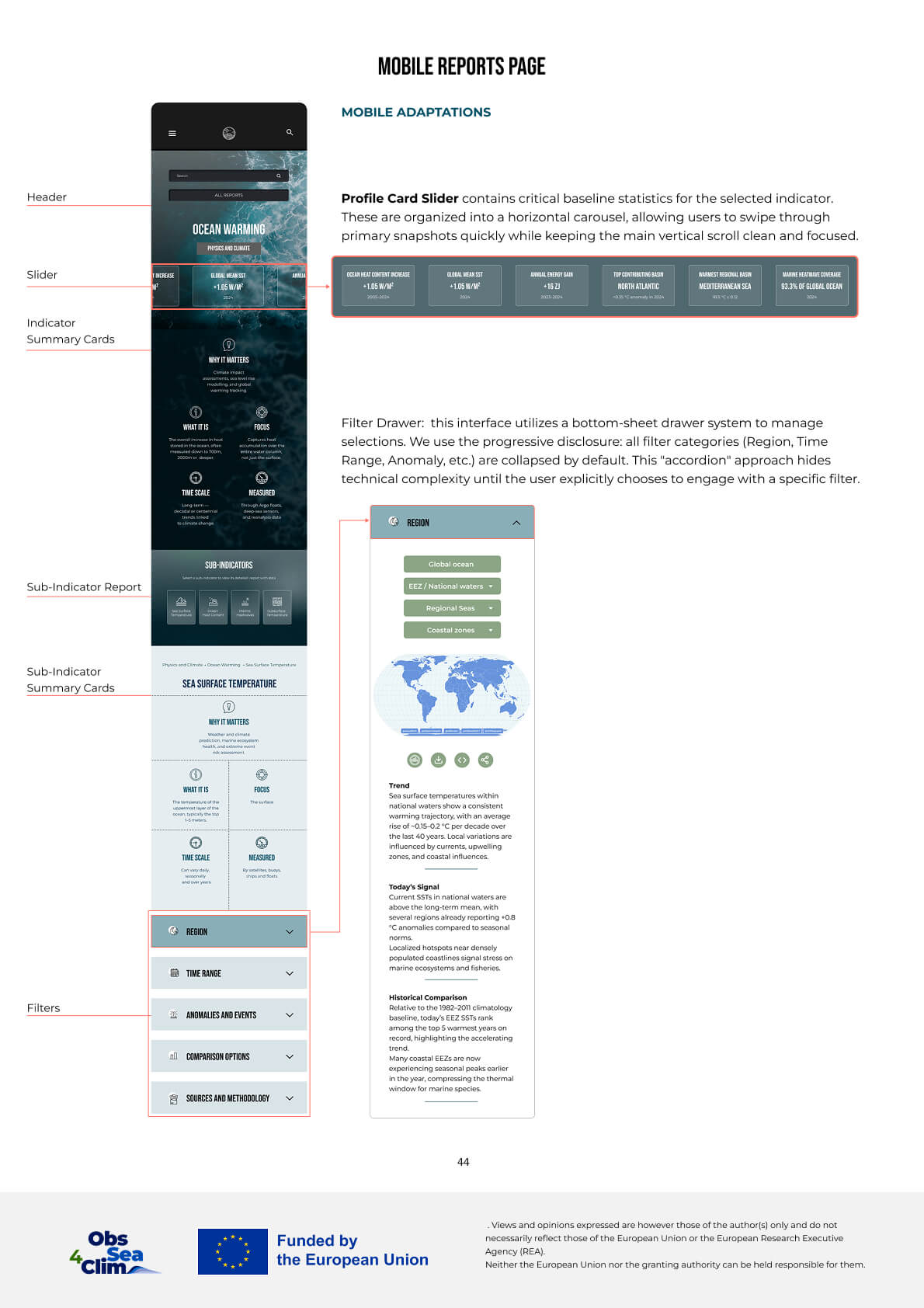
Reports mobile
Map
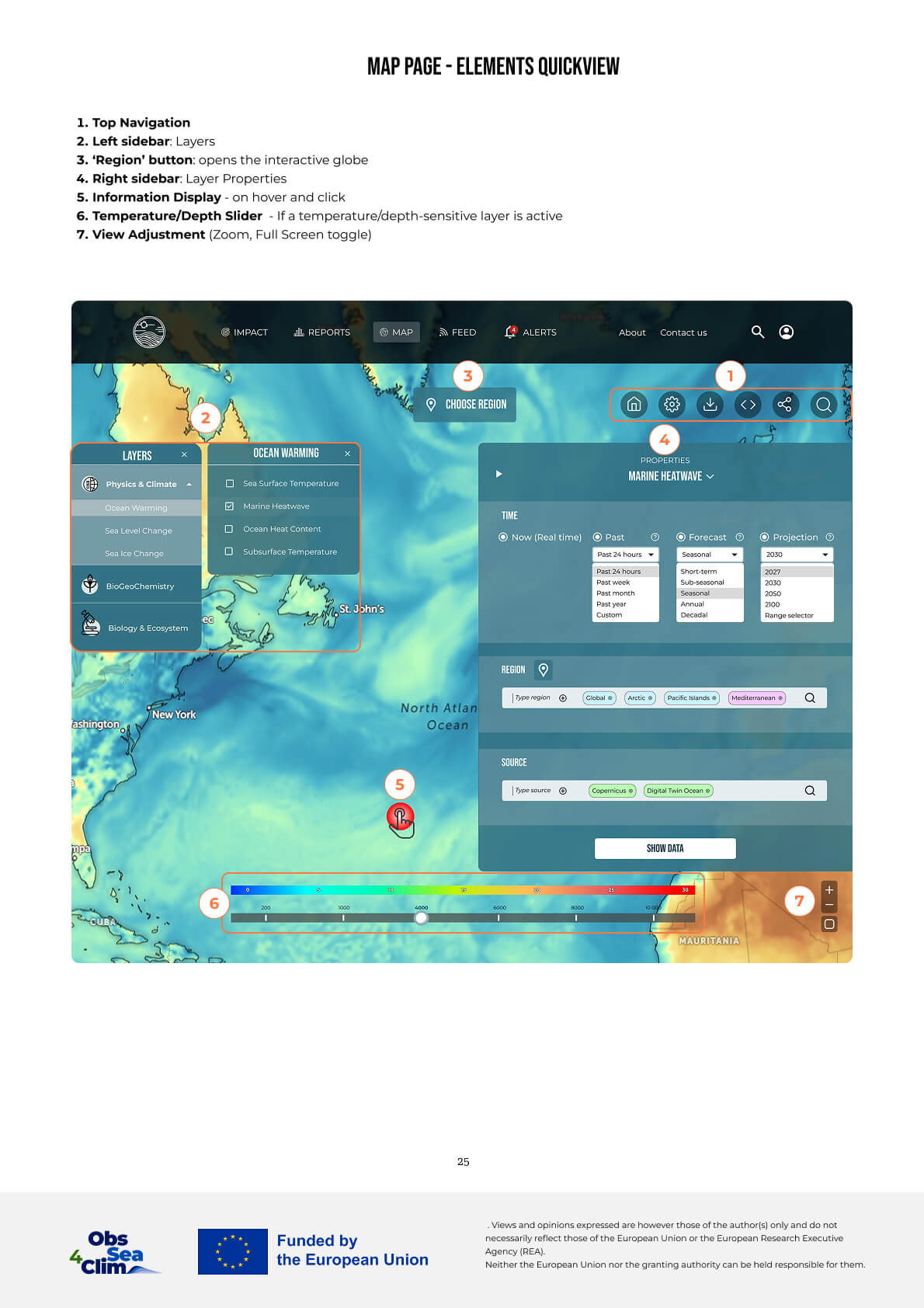
Map elements
Map displays
Map mobile
Outcome
The platform establishes a structured approach to ocean data interpretation, connecting high-level policy needs with complex scientific indicators.
By combining layered information architecture with an LLM-assisted interface, the system improves how policy makers access, interpret, and act on data.
- ● Unified hierarchy across indicators
- ● Consistent navigation structure
- ● Standardized outputs
- ● Dedicated entry points for different user groups
- ● Progressive data exploration from summaries to scientific data
- ● Aligning diverse user needs through a unified data structure and outputs
- ● Access to actionable insights for policy contexts
- ● Faster comparison across regions, timeframes, and indicators
- ● Surfacing critical environmental issues and enabling policy action
A platform that can be explored not only with clicks, but with questions — grounded in transparent data and designed for human decision-making— would turn ocean intelligence from something people consult occasionally into something they can work with every day.