UX / UI design
Design System
Design Thinking
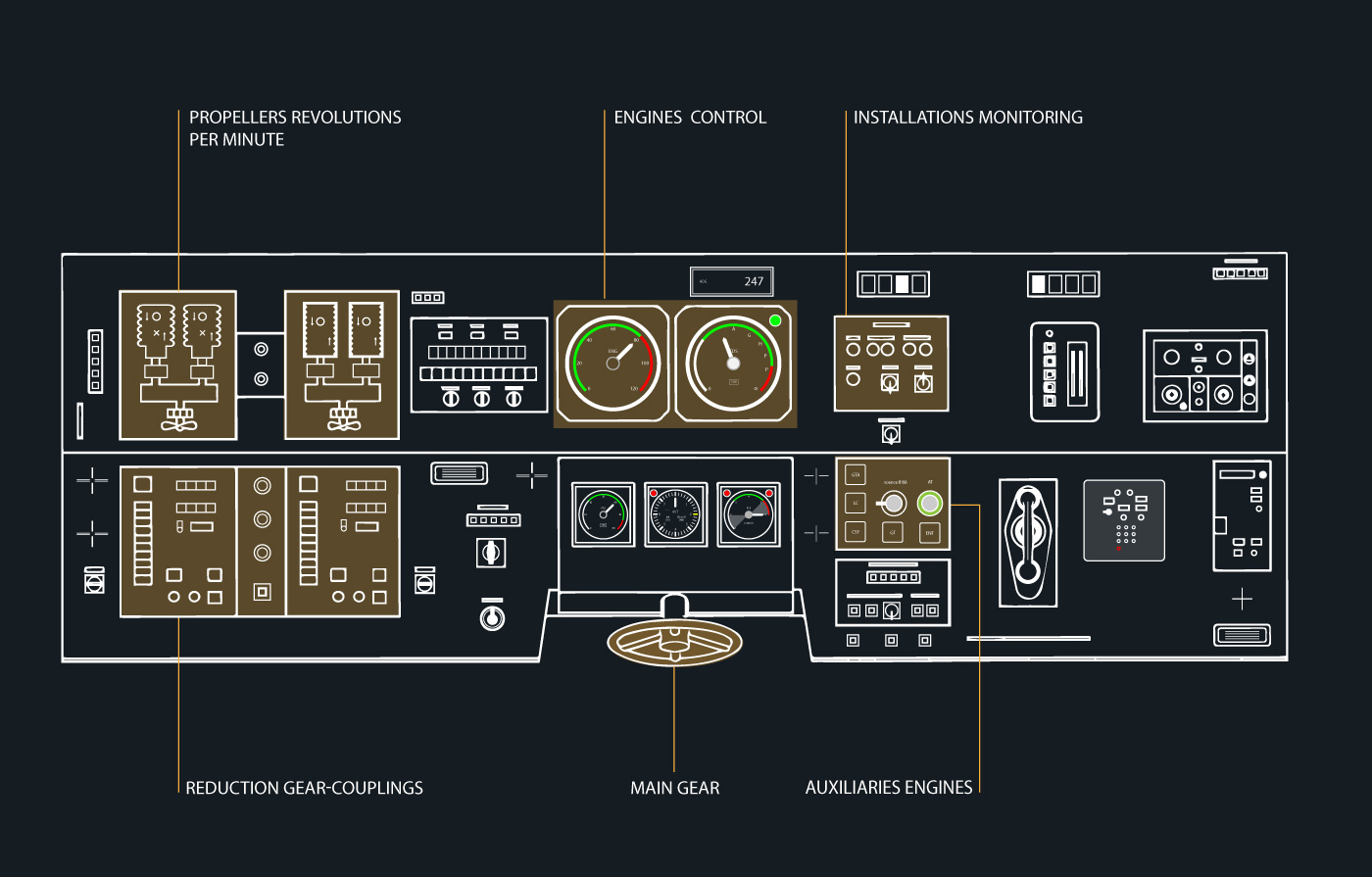
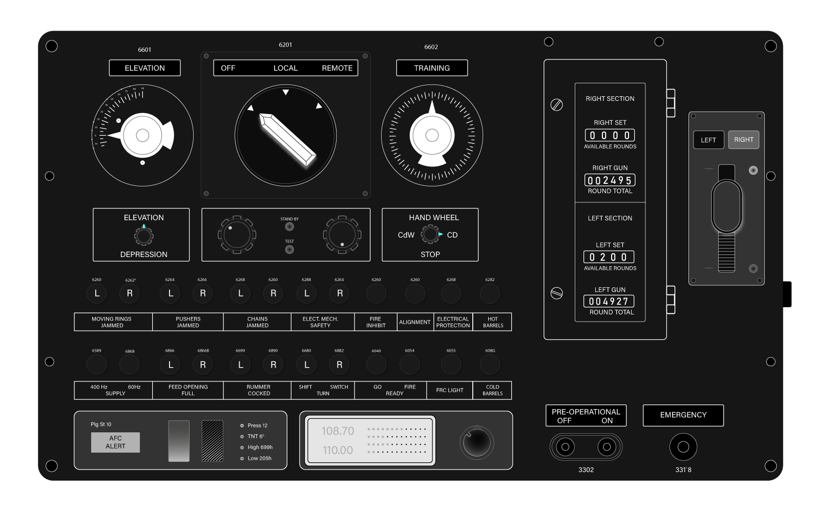
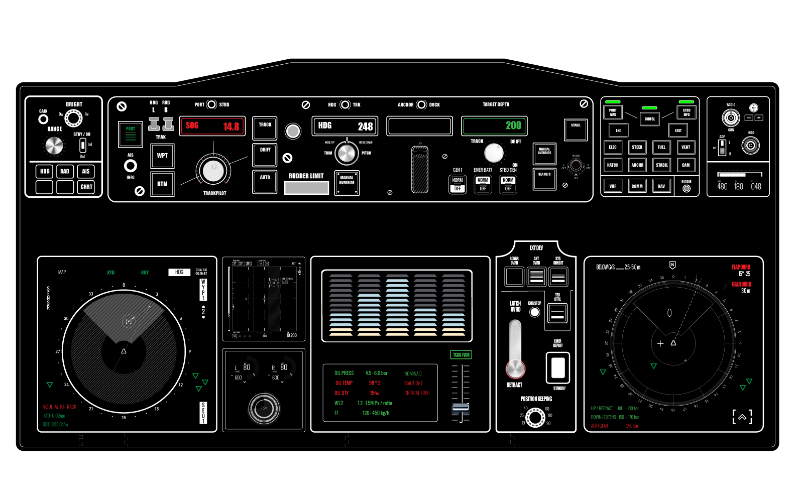
INTEGRATED BRIDGE SYSTEM & TACTICAL CONTROL
Here are some samples of my work in E-learning design for maritime systems. Creating the interface mockup of a Bridge Control Board involved analyzing instrument placement, optimizing control layouts, and considering maritime ergonomics—progressing from hand sketches to a high-fidelity digital design.
I involve naval officers in my 'user testing' sessions to gather professional feedback and uncover new operational insights. This allows me to refine the design through those famous, crucial iterations. I find my professional satisfaction in precisely engineering and positioning every key element, from analog gauges and toggle switches to complex tactical displays
Fregat control panel scheme
Tactical console
Integrated Bridge System
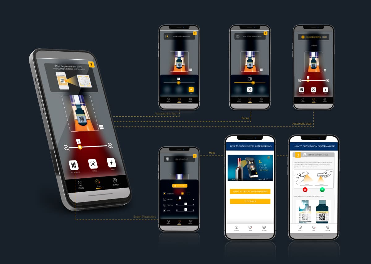
SCAN APPLICATION
At first glance, developing a scanning application may seem straightforward. However, the process is often filled with unexpected challenges and complex decision-making. I needed to integrate multiple functionalities within a single screen while ensuring a right UX.
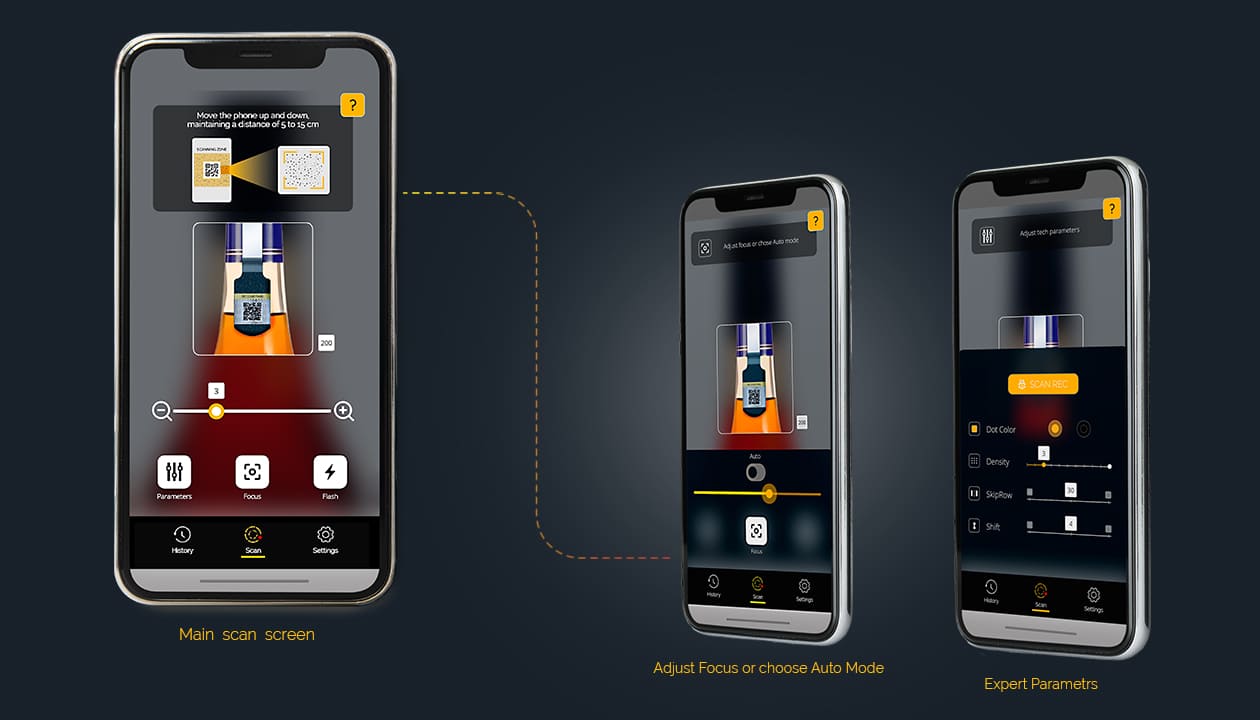
My task was to design an intuitive UI, to craft a comprehensive help section with clear documentation, and to produce a detailed tutorial video to guide users through the application’s features. It was tough, but inspiring, I must say.
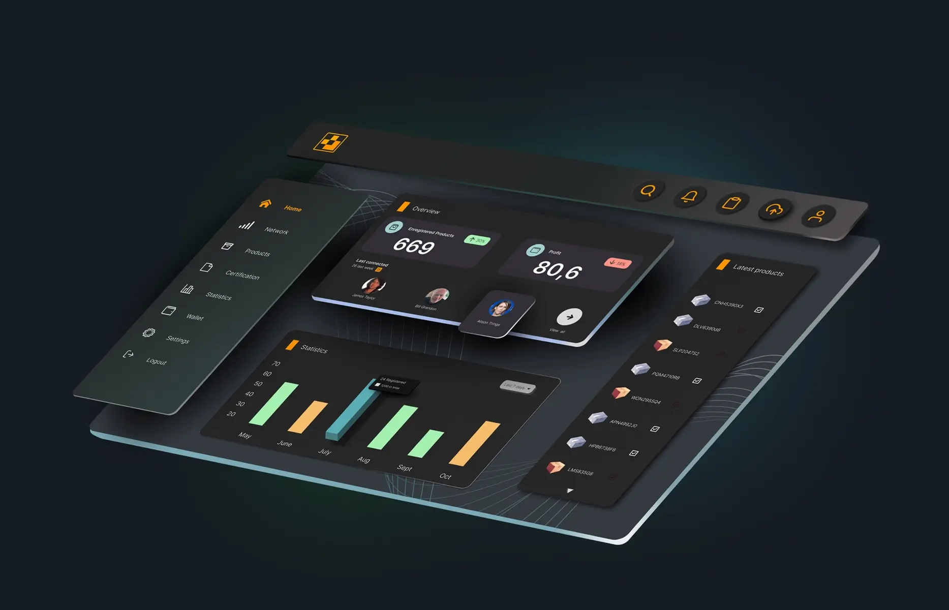
VerifyHub Saas PLATFORM
VerifyHub is an all-in-one web platform for multilevel product line
management, real-time
statistics, certification tracking and comprehensive reporting.
I had to turn detailed
product data,
statistics, certifications and millions of its settings into a clear tool that’s easy to
navigate without losing
depth.
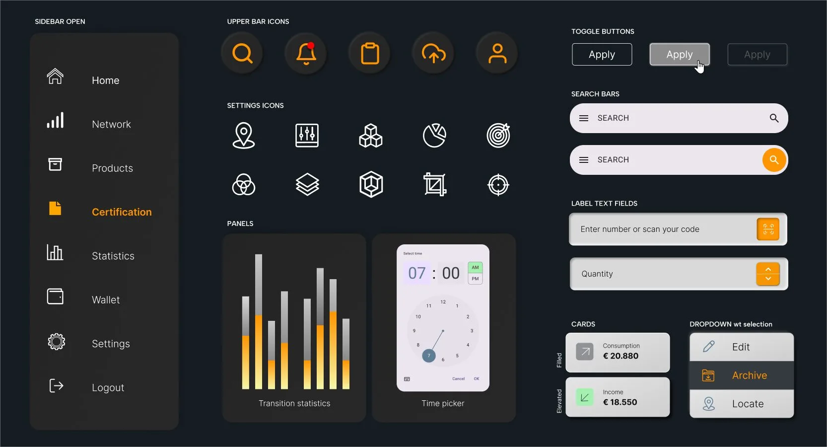
UI Elements
Flyadeal UX/UI CONCEPT REDESIGN
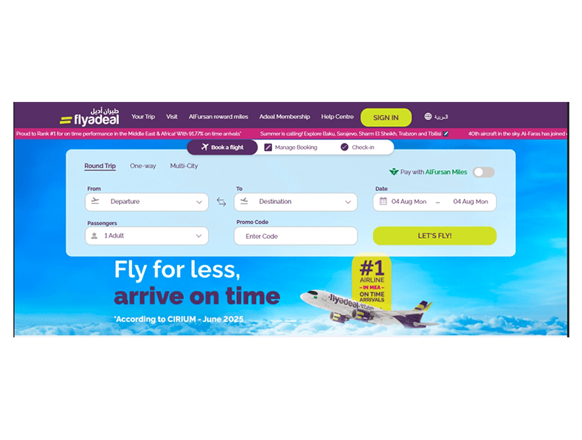
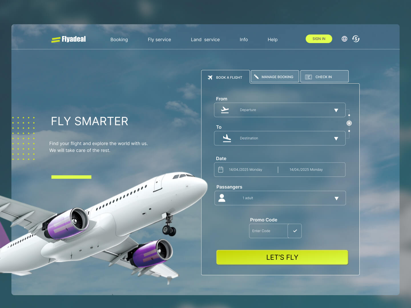
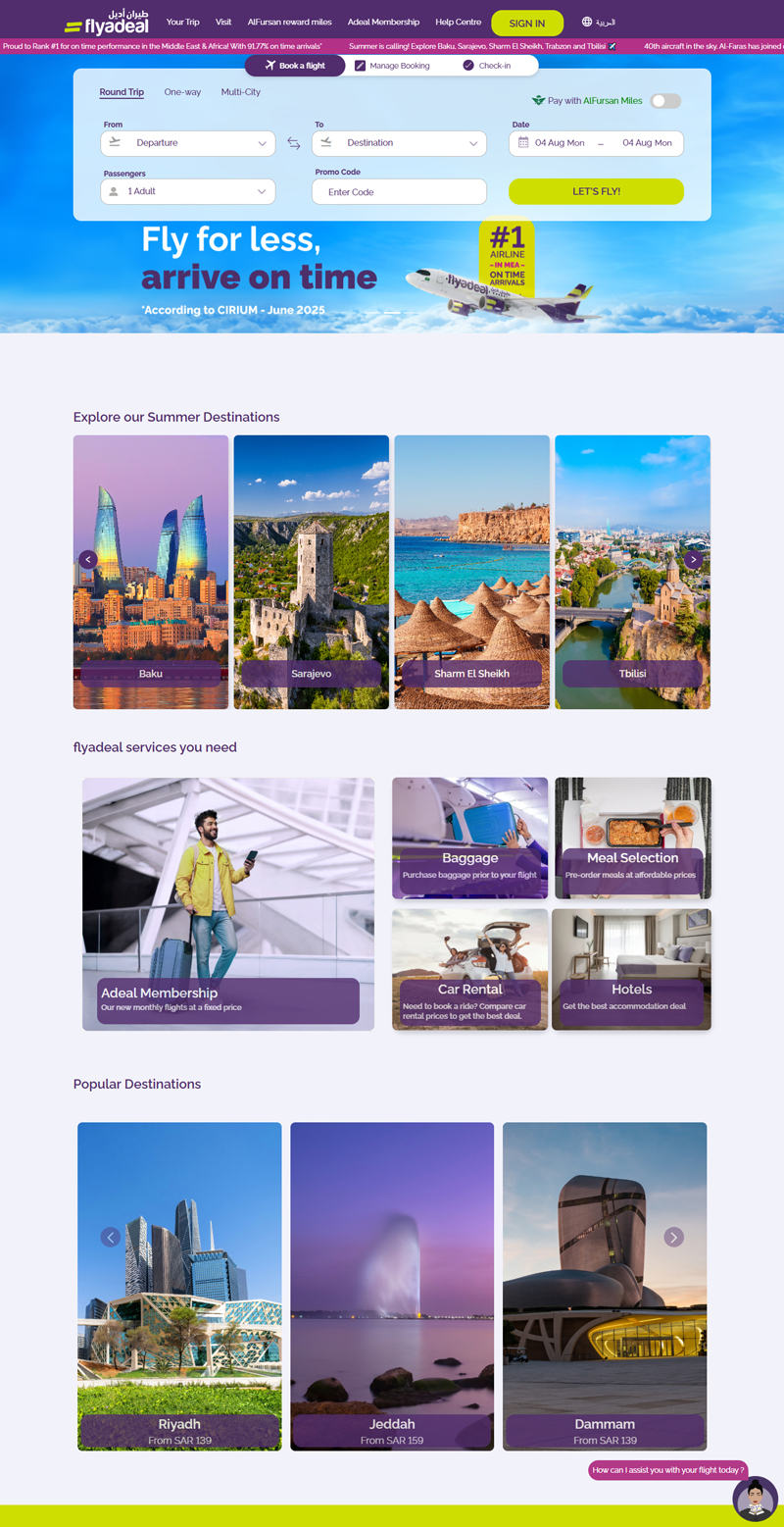
This is a proposal from Airbus to redesign the Flyadeal’s airline website. The goal was to quickly improve clarity, usability and user engagement through a clean, modern and conversion-optimized UI.
Industry
Airlines / AviationTravel & Tourism
Online Booking
Role
UX ResearcherUX/UI Designer
Interaction Designer
Usability Analyst
Toolkit
Pencil & Paper (for ideation & wireframing)
Illustrator & Photoshop
Figma
FigJam (for collaborative UX workshops)
Project type
Web Platform RedesignInformation Architecture
User Flow & Journey Mapping
Usability Testing
Interaction Design
Before
After
REBRANDING AUDIT
The brand's current digital presence is functional but dated, with limited visual storytelling and UX innovation.
Problems identified
| Category | Issues |
|---|---|
| Visual | Overly bright, garish colors and funny fonts |
| Banner | Distracting animation; not SEO-friendly text in images |
| Logo | Logo is chunky abd heavy; presented as raster, so not scalable or responsive |
| Navigation | Inconsistent layouts, broken links, confusing structure |
| Layout | Unclear sections, stock images, unreadable text |
| User Flow | Promotions prioritized over booking and services |
For the redesign, I decided to preserve the core identity of Flyadeal — keeping the recognizable color direction, logo concept, and overall mood — while refining them into a more elegant and professional visual system. The updated palette tones down the overly bright, garish hues in favor of more balanced contrasts, while the typography shifts away from playful, teen-oriented fonts to a more modern, business-ready look that still feels approachable.
New Design
| Category | Redesign |
|---|---|
| Visual | Adopt elegant, mature color palette and modern typography |
| Banner | Clean, non-distracting visuals with SEO-friendly text |
| Logo | Use scalable SVG with sleek, professional look |
| Navigation | Consistent menus, simplified structure, functional links |
| Layout | Clear sections, meaningful visuals, easy-to-read text |
| User Flow | Prioritize booking and service information over promotions |
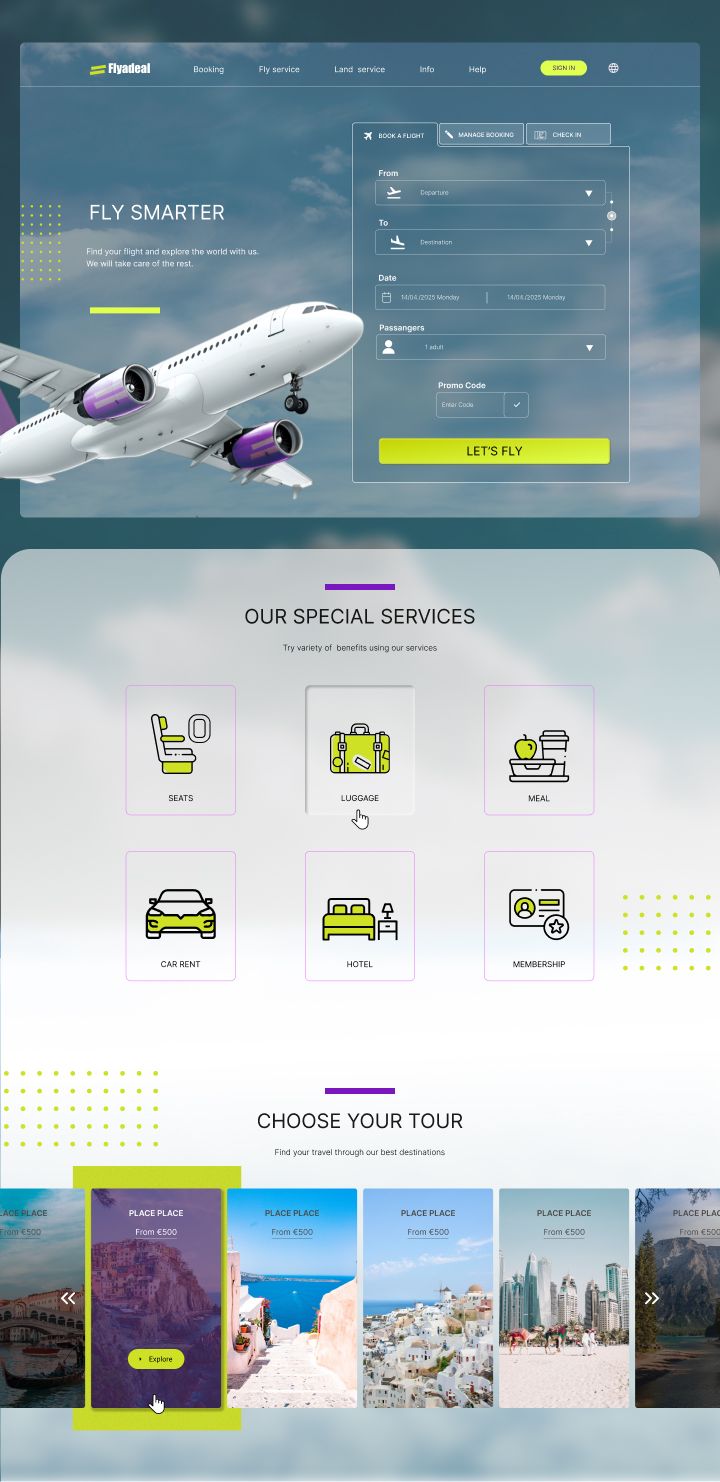
The interface design introduces a cleaner layout with generous spacing and subtle visual hierarchy, reducing clutter and distraction.
Altogether, the redesign maintains Flyadeal’s friendly identity while presenting it through a more elegant, mature, and credible user experience that balances professional trust with a sense of travel joy.